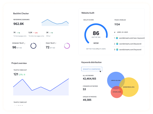
Looking for creative, engaging ways to share data, tell stories, or explain complex topics? Infographics are one of the most effective tools for visually presenting information in an engaging and easy-to-understand format. In this guide, we’ll dive into a range of infographic examples to show how these visual tools simplify information, capture attention, and improve retention. From learning about different types of infographics to mastering design best practices, this guide will help you create visuals that stand out. Whether you’re new to infographics or simply want to refine your design skills, the examples of infographics here will inspire your next project and guide you in creating infographics that look professional and impactful.
Why Infographics Are So Effective
Infographics combine text and visuals to make complex data and concepts easy to understand. Here’s why infographics are a highly effective form of content:
- Visual Appeal: Infographics are naturally eye-catching, using bold colors, layouts, and icons to make content more visually engaging. By turning information into visuals, infographics make your message stand out in a sea of text-heavy content.
- Enhanced Comprehension: Visuals can break down complex information, making it easier to understand. When done right, infographics simplify data so readers can quickly grasp the main points without feeling overwhelmed.
- Improved Retention: People remember visual information better than text alone, and infographics capitalize on this by combining data with visuals. This makes them an ideal tool for ensuring that your audience remembers your message long after they’ve seen it.
- SEO and Shareability: High-quality infographics can drive engagement, encourage backlinks, and boost social shares. A well-designed infographic can also increase the time visitors spend on your website, a factor that can improve your search rankings.
Types of Infographic Examples (With Examples)
Infographics come in a variety of types, each designed to serve a specific purpose. Let’s explore the most popular types and see how each one serves a unique need in presenting information.
- Informational Infographics
These infographics are perfect for summarizing detailed information, educational content, or step-by-step guides. Informational infographics work well for breaking down processes, explaining complex ideas, or walking readers through a topic. - Statistical Infographics
Statistical infographics use data visualizations like charts, graphs, and icons to present survey results, industry stats, or trends. They are ideal for sharing data-heavy content in a way that is visually engaging and easy to digest. - Timeline Infographics
Timeline infographics present events or milestones chronologically, making them a great choice for illustrating a company’s history, product evolution, or a step-by-step project timeline. - Process Infographics
Process infographics are used to show a series of steps, such as a workflow or a production process. They provide readers with a clear, step-by-step overview of a topic or procedure, making them useful for tutorials or explaining complex processes. - Comparison Infographics
Comparison infographics help readers understand differences between two or more options, such as comparing products, features, or pros and cons. This type is especially useful for content that requires a side-by-side structure to simplify decision-making. - Geographic Infographics
These infographics use maps and other geographic visualizations to present location-based data, such as demographics, market stats, or regional trends. Geographic infographics are effective for showing how data varies across locations or regions.
Best Practices for Designing Infographics
Creating an effective infographic requires attention to design principles that make the information clear, engaging, and visually appealing. Here are some best practices to keep in mind when designing infographics:
- Clarity and Readability: Choose fonts and layouts that are easy to read. Avoid overcrowding elements on the page, as this can overwhelm viewers. Use clear and legible fonts for headers and body text to maintain a clean, accessible design.
- Consistent Branding and Colors: Stick to your brand’s color scheme and font styles to maintain a cohesive look. This consistency not only strengthens brand recognition but also creates a polished, professional appearance.
- Choose the Right Data Visualizations: Match the type of data you have with the right visualization method. For example, use a pie chart to show proportions, a bar chart to display comparisons, and a line graph to illustrate trends over time. Misusing data visualization techniques can confuse viewers and lessen the infographic’s impact.
- Create a Logical Flow: Guide viewers through the infographic in a logical order. Typically, infographics are designed top-to-bottom, with key points highlighted in larger fonts or colors. Arrange elements in a way that directs readers’ eyes naturally from one section to the next.
- Balanced Visuals and Minimal Text: Keep text to a minimum and rely on visuals like icons, charts, and images to tell the story. The purpose of an infographic is to visually present information, so use images to explain points and avoid overcrowding with text.
10 Stunning Infographic Examples and What Makes Them Great
To get inspired, here are 10 standout infographic examples that illustrate different design strengths:
- Internet Usage Statistics
- Highlight: This infographic uses contrasting colors and regional segmentation to present data clearly. By color-coding different regions, it allows readers to quickly identify which areas have the highest and lowest internet usage.
- Digital Marketing Funnel
- Highlight: The funnel shape in this infographic directs the viewer’s eye from top to bottom, illustrating the journey from awareness to conversion in a digital marketing campaign.
- Renewable vs. Non-Renewable Energy Comparison
- Highlight: Side-by-side visuals help simplify the complex topic of energy sources, making it easy to see the benefits and drawbacks of each.
- Product Launch Timeline
- Highlight: This timeline infographic uses clear labels and icons to map out a step-by-step guide to launching a product, providing readers with an organized, chronological view.
- Social Media Engagement Statistics
- Highlight: Visual charts and icons emphasize key statistics about social media use, capturing viewers’ attention with data they can digest at a glance.
- Recipe Infographic: Smoothie Ingredients
- Highlight: With icons representing ingredients and color coding to show nutrient benefits, this infographic appeals to health-conscious readers.
- Beginner Workout Plan
- Highlight: Each exercise is illustrated with icons, and the plan is broken down into manageable steps, making it user-friendly for fitness beginners.
- Customer Demographics by Location
- Highlight: A map-based infographic visually represents demographic data, providing geographic insights in a visually engaging format.
- Smartphone Feature Comparison
- Highlight: This comparison infographic uses a grid layout to show product specs side-by-side, making it easy for readers to compare options quickly.
- Brand Evolution Timeline
- Highlight: With a blend of images and dates, this timeline infographic takes viewers through a brand’s history, showing its growth and changes over time.
How to Create Your Own Infographic
Ready to create an infographic? Follow these steps for a smooth design process:
- Define Your Purpose: Start by clarifying the goal of your infographic and identifying your target audience. Understanding your purpose helps you determine the right type of infographic to create.
- Gather Data and Content: Collect all necessary data, statistics, and key points you want to include. Make sure the information is accurate, credible, and relevant to your audience.
- Select the Right Type of Infographic: Choose the infographic type that best suits your content, whether it’s a timeline, comparison, or statistical infographic.
- Choose a Design Tool: Use a design tool like Visme, Canva, or Venngage for easy drag-and-drop design. These tools provide templates that can save you time and simplify the design process.
- Organize Your Content: Structure your content with a clear hierarchy, including headers and subheaders to make it easy for readers to follow.
- Add Visual Elements: Use icons, images, and charts to highlight key points. Visual elements should enhance the message, not clutter the design.
- Review and Optimize: Double-check for any errors, ensure readability, and make adjustments for SEO, like using alt text and optimizing file sizes.
Common Mistakes to Avoid When Designing Infographics
Creating infographics comes with its share of potential pitfalls. Avoid these common mistakes to ensure your infographics are effective and user-friendly:
- Overloading with Text: Remember, infographics are meant to simplify information. Stick to brief summaries and use visuals to communicate details.
- Inconsistent Data Visualization: Using the wrong type of chart or graph can make data confusing. Match your data with the most appropriate visual format.
- Cluttered Layout: Too many colors, icons, or images can make an infographic look chaotic. Aim for a clean, balanced design that enhances readability.
- Mismatched Color Choices: Use colors that complement each other. Avoid excessive colors or clashing combinations, which can make the infographic hard to look at.
SEO Tips for Infographics
An effective infographic is also optimized for search engines. Here’s how to boost the SEO impact of your infographics:
- Primary Keywords: Use primary keywords like “infographic examples” in titles, descriptions, and file names.
- Image Optimization: Compress your infographic files to reduce load times and include alt text to make them accessible and indexable.
- Encourage Backlinks: Share your infographic on social media, reach out to bloggers, or provide an embed code to make it easy for others to share.
- Include Detailed Descriptions: When publishing your infographic, write a detailed description or article to go with it for better indexing and to target more keywords.
- Social Sharing: Add social sharing buttons to encourage engagement and expand reach.
Conclusion
Infographics are powerful tools for enhancing engagement, simplifying complex information, and boosting SEO. By exploring infographic examples and following best practices, you can craft visuals that effectively communicate your message and resonate with your audience. Whether you’re explaining data, creating a process guide, or designing a timeline, infographics help elevate your content strategy. Ready to start creating? Use these tips, choose your tools, and let your data tell its story visually!
Frequently Asked Questions:
Q1. What are infographic examples?
A1. Infographic examples are visual representations that simplify complex information using visuals like icons, charts, and images to make data easier to understand and remember.
Q2. How do infographics improve SEO?
A2. Infographics improve SEO by increasing user engagement, generating backlinks, and encouraging social shares. These factors signal search engines that the content is valuable.
Q3. What are some popular types of infographics?
A3. Popular types include informational, statistical, process, timeline, and comparison infographics. Each type is tailored to different presentation needs.
Q4. How do I choose the right type of infographic?
A4. Choose based on your content. For instance, use a timeline for historical data, or a comparison infographic to illustrate differences between two options.
Q5. Which tools can I use to create infographics?
A5. Visme, Canva, and Venngage are popular options with user-friendly interfaces and pre-made templates that make designing infographics easier.
Q6. How do infographics improve engagement?
A6. Infographics use visuals to break down information, making content more engaging and easier to consume. This often leads to more shares and interactions.
Q7. What data can I use in an infographic?
A7. Ensure that your data is accurate, relevant, and clearly presented. Good data increases credibility and effectiveness.
Q8. What should I avoid in infographic design?
A8. Avoid overcrowding, inconsistent visuals, excessive text, and clashing colors. Stick to simple, clear, and structured designs for better readability.


